Website Updates on Medicare.gov: A MarComm Perspective on the New Look
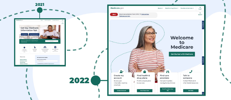
In 2021, the Centers for Medicare and Medicaid Services (CMS) began updating the customer-facing homepage and relevant linked pages on Medicare.gov. When we compared screenshots from 2021 to the same webpages in 2022, we noticed substantial improvements in four primary categories:
- Clarity or simplification of messaging and language
- Stylization or “brand” consistency
- Ease of navigation
- Spacing, structure, or readability
Previously, the site was dense, difficult to read, overloaded with information and could be a challenge to navigate. Since the update, the navigation makes content easier to find, simpler to understand and uses consistent design elements such as color. The changes are in line with best practices for simplifying webpages to help guide users through the journey. This also fits with the trend we are seeing across clients to declutter and clean up webpages.
These changes make sense considering the audience using the webpages. Medicare-eligible consumers prefer straightforward website navigation. The new site presents information in an uncomplicated, less complex way, making the overall user experience more satisfying.
The pandemic highlighted the importance of having independence, especially for a population that is more at risk and may normally feel reliant on others. But most people are not experts in health insurance. The Medicare.gov redesign takes that reality into account. Someone with no health care experience can easily navigate the new webpages on their own without interacting with a representative.
Click the SlideShare to take a look at the biggest updates to the Medicare.gov website from 2021 to 2022. You can also download a PDF version of the deck.
Any questions? Reach out to Media Logic today.