Apple Bucks Credit Card Marketing Best Practices
If you have been awake for the past six months (or paying attention to all things financial services), you no doubt heard that Apple launched a new credit card with Goldman Sachs in August. As FS marketers, we have been watching with interest how Apple is (and, more importantly, is not) using card marketing best practices to sell its newest product. It offers a good case study in how a beloved brand can use its clout to break from a traditional approach to credit card marketing.
The Apple Card is hardware
One realization we had when looking at Apple’s approach to card marketing is that it’s not a card: it is a new piece of Apple hardware. More accurately, it is a combination of hardware and software, and Apple knows how to market a combination like that. The brand has been doing it forever. When you look at it from that perspective, it is no surprise that Apple is bucking some card marketing best practices.
Clean and consistent branding
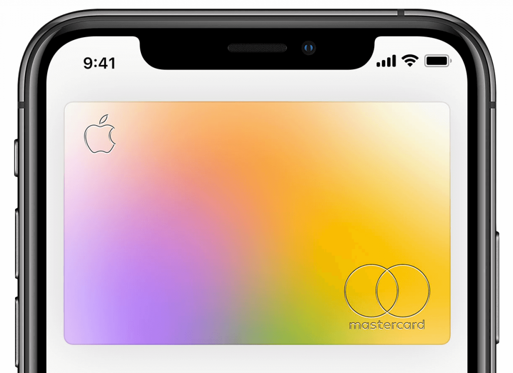
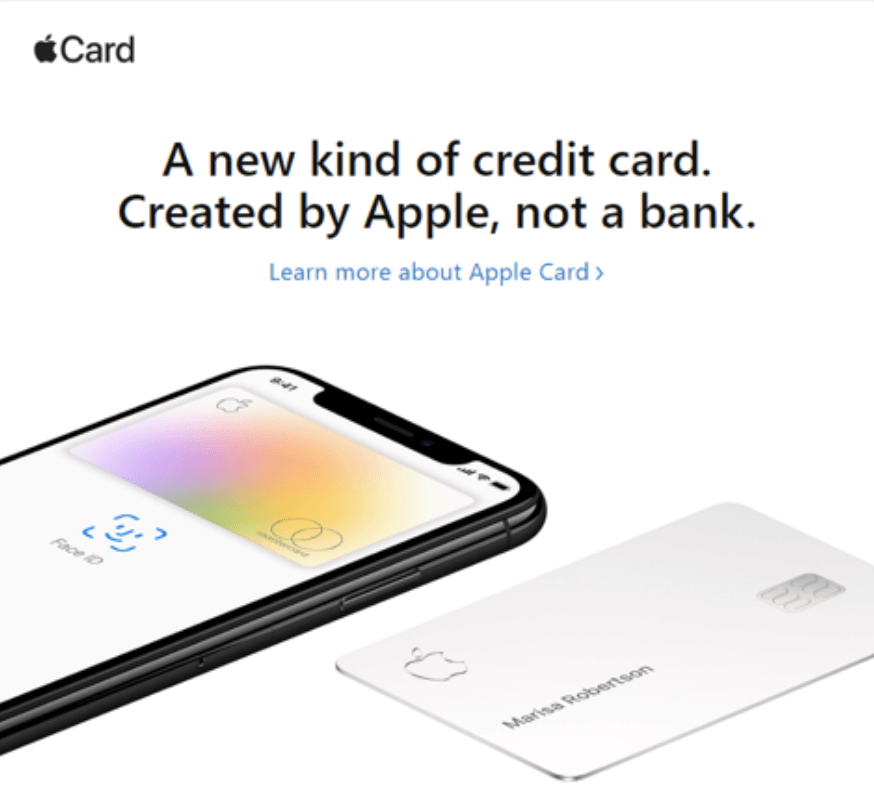
Apple declares that this is “a new kind of credit card. Created by Apple, not a bank.” And the brand has done its best to deliver on that while ignoring long held card marketing requirements. The front of the card has only the Apple logo, the cardholder’s name and the EMV chip. The logos for the issuer, Goldman Sachs and the payment network (MasterCard) are relegated to the back.
The clean, white design is pure Apple. Even the mag stipe is minimalist. The card number, expiration date and CVV code are non-existent, relegated to the Apple’s Wallet app. It’s as if Apple has extended the goal minimizing the number of ports on a Mac to the amount of information on the card face.
A card built for iPhone users
There is no doubt that the main target audience for the Apple Card is iPhone users. Specifically, the card targets heavy Apple users, who are more tech savvy. They are also likely Mac users and Apple-evangelists. These are the folks who love Apple (hence the clean card design), likely have the latest iPhone model and have deep product knowledge.
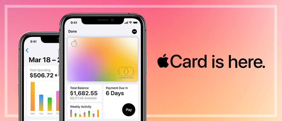
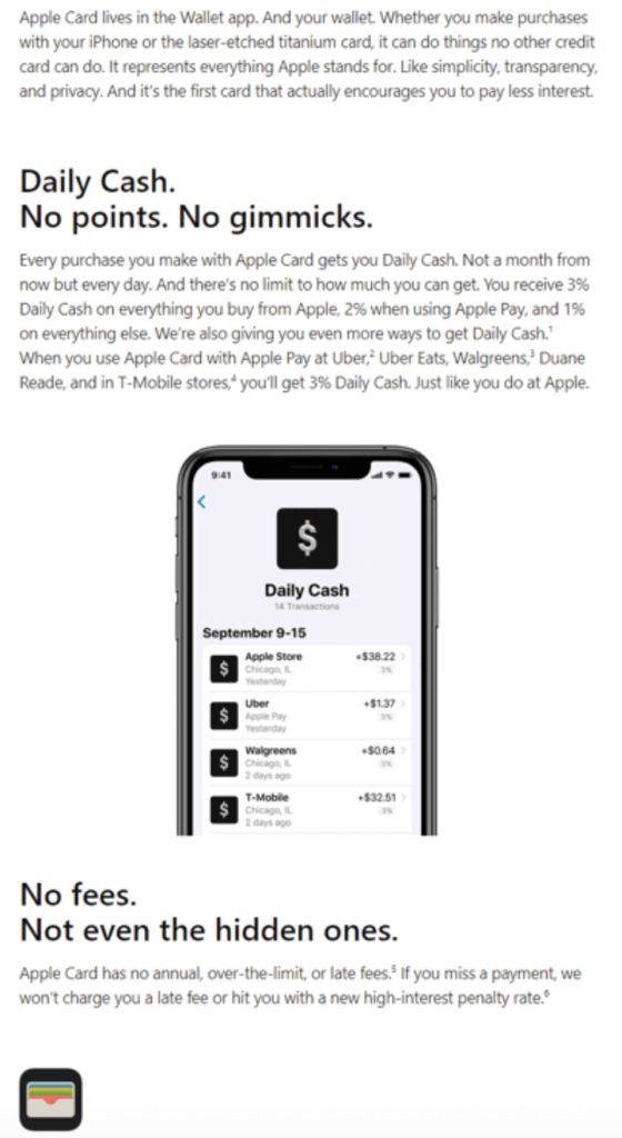
Indeed, the key feature of the card is how well it integrates into the iPhone and Wallet app. When the card was announced in March, Apple proclaimed that the card is “built into the Apple Wallet app on iPhone, offering customers a familiar experience with Apple Pay and the ability to manage their card right on iPhone.” In fact, you don’t even need to have the physical card. Cardholders can apply and start using it right away with Apple Pay.
To help set the card apart in the Wallet app, Apple has built in a unique feature: the card that is displayed on the phone changes color based on the type of purchase cardholders make (green for travel, blue for transportation, orange for food and drink, etc.). The result is a rainbow of MCC codes. For the card’s core audience – those ones with deep product knowledge – this serves as a visualization of data related to their spending habits. Even for users who are unaware of that feature, it still looks cool.
All of this has the effect of making the card another gadget for the iPhone.
Simplified acquisition with minimal messaging
When it comes to card acquisition, Apple seems to be using owned channels, like email, the App store and banners in Apple News. More notable than channel is the content (or rather lack of content). Take a look at the static banners* and emails* Apple is currently running.
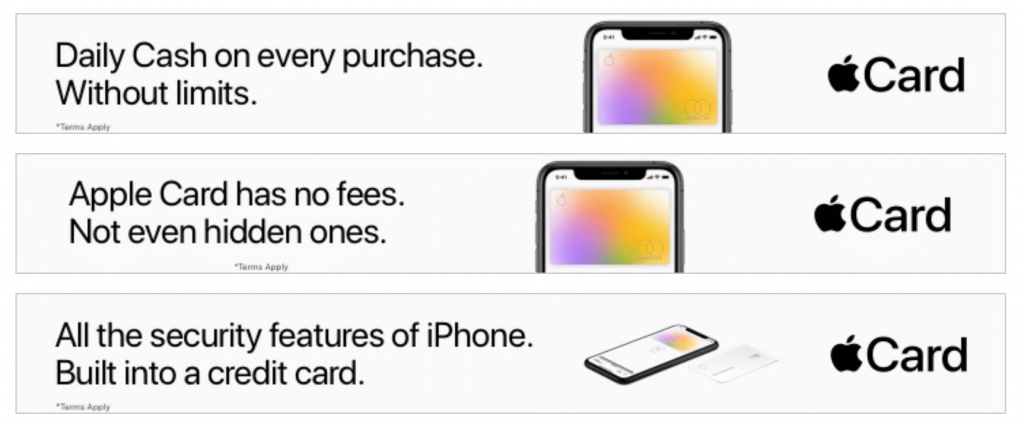
There are a few things that stood out to us with the creative approach. First, there is no offer. Apple is not touting a big splashy sign-up bonus like most cards. Speaking of lack of splash, there is nothing glitzy about this creative, and really, there doesn’t have to be. The card itself provides the cool factor. In classic Apple fashion, the brand uses design to carry the day, and it works.
Finally, it is worth noting that the banners are mostly focused on a single message/feature. And they use about a half a dozen headlines that are repeated in slightly different layouts and formats. And note the CTA: here, too, Apple uses a very simple, basic and on-brand approach.
“iPhone like” landing page
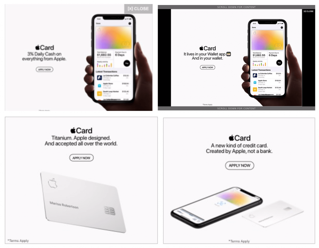
Speaking of being on-brand, when it comes to the credit card landing page, Apple ensures that there can be no confusion what the company is bringing customers with this product. Traditionally, a co-brand card will have a static landing page with minimal interactive elements. Not Apple. Its landing page is an Apple product page. Just look at how it sells the card and then compare it with the pages for other products like the iPhone 11, the Apple Watch and AirPods.
Big, bold, silhouette photos of the product? Check.
Sections for each feature that spool out one-by-one? Check.
Parallax? Check.
A seemingly endless page scroll? Check.
There no mistaking this for any other type of product.
A card carrier unlike any other
Packaging is always been a critical part of the Apple experience, so it is no surprise that the new card dispenses with the traditional card carrier. We found this “unboxing” video on YouTube:
There is no CTA for activation, no 1-800 number to call or website to visit. New cardholders just wave their iPhone near the card packaging. Even the reviewer says it’s “just like any other pair or AirPods.” This is a brilliant and simple approach, but likely only one that Apple could pull off.
And, of course, it seems to be working
While it is hard to find an exact number of accounts booked, Goldman Sachs did announce that it has lent out about $10 billion in credit. And that’s just in the first two months. It’s worth noting that the Apple Card is casting a wide net, even extending credit to subprime borrowers, so extending that much credit in that short of a time speaks to both product demand and possibly demand for credit (though we suspect its more the former).
But things have not been all trouble-free. Just this month, the New York Department of Financial Services opened a probe to investigate Goldman’s lending practices. This was sparked after tweets from Basecamp co-founder David Heinemeier Hansson and none other than Apple co-founder Steve Wozniak claiming that they received 10 times more credit than their wives did, despite having the same or similar assets/incomes. The accusations of gender discrimination by “black box” algorithms led to the probe.
It’s a good reminder to Apple that no entry into a new category will be without issues and that declarations like “created by Apple, not a bank” can cut both ways.
* SOURCE: Mintel Comperemedia, October-November 2019