Creating Mobile Email That Works
Studies report that the healthcare industry boasts one of the highest overall email open rates of 26.2%. However, it has one of the lowest mobile email open rates of 20.65%. And with 66% of all emails now being opened on mobile devices, it’s important to address this issue.
One obvious reason for the low click-throughs is that functional emails (statements, plan summaries, etc.) contain detailed, private information that users would not want to receive on their mobile devices. But another culprit for the low click-through rate could be that healthcare lags behind other industries in developing mobile-friendly emails.
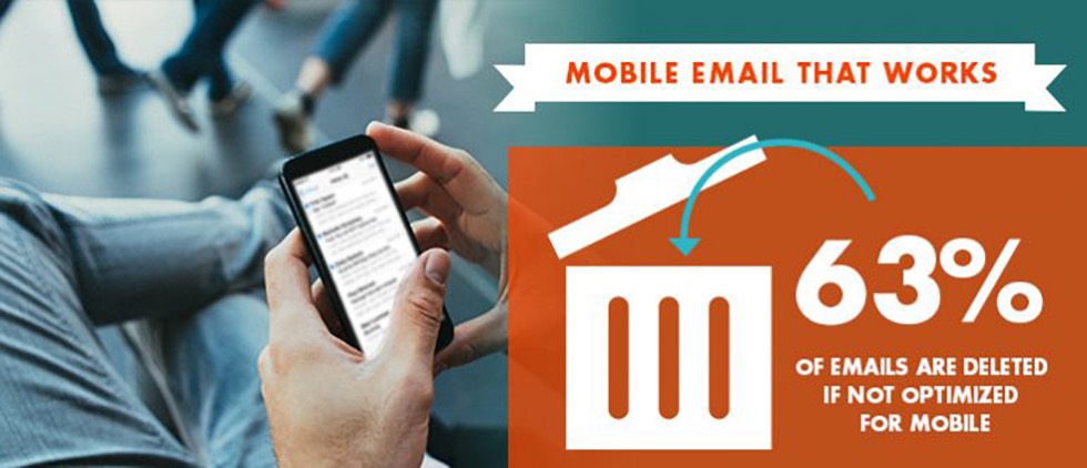
63% of mobile users close or immediately delete emails not optimized for mobile.
Simply put: if your emails are not mobile-friendly, you are literally turning away prospects at the door. Here are six things you should be doing to optimize your emails for today’s mobile audience.
1. Make a good first impression.
When using their phones, people decide whether or not to open an email in one second. Your first impression is what prospects see before opening the email. It is comprised of three parts:
- From line – According to recent data, 42% of U.S. consumers surveyed said familiarity with the sender is the main influence on deciding whether or not to open a promotional email.
- Subject line – 20% of consumers in the same survey cited the subject line as the key influencer in opening an email. To make it work as hard as possible, keep in mind that mobile email windows show minimal content. The ideal subject line character count for mobile is less than 35 characters. Some Android devices only show 24 characters. Anything longer won’t be seen, so be sure to put the most compelling reason to open at the front of the subject line.
- Preheader – Preheaders, or preview copy, appear below the subject line in most email windows. This content is the first copy in the email, which, unfortunately, is generally something like “If you have trouble viewing this email, click here.” But you can use preheader copy to supercharge your subject line. In fact, emails that utilize a preheader can generate a 19% higher open rate. Make sure the message is different from your subject line. And remember that preheaders are 75 characters or less – the shorter the better.
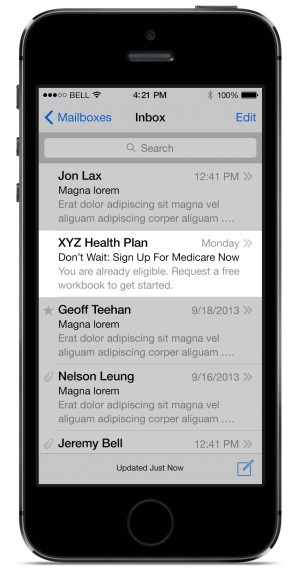
Here’s an example of how a subject line and preheader look in a mobile inbox to communicate interest, offer and urgency:
Now that recipients have opened the email, you have to act quickly. They decide whether or not to delete it in three seconds.
2. Design for a smaller, narrow screen.
- Mobile emails are narrow – with a 300-400 pixel width. So if you don’t build responsive, then at least build to this size and let the desktop email be narrow.
- Keep important information and calls-to-action to the left of the email to ensure they are seen.
- Stick with a single, narrow column, and go deep if you need to. While you want to keep key information visible upon opening the email, new studies show that people have embraced scrolling on mobile devices. However, they aren’t likely to swipe left to right or pinch to resize.
- Think tap, not click. Links should be “tappable” by a finger, not “clickable” by a mouse, so your calls-to-action should be buttons at least 40px x 40px. Also, make sure all links are far enough apart. Even if the links are going to the same location, users are less likely to click if they fear they’re going to hit the wrong thing.
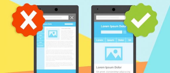
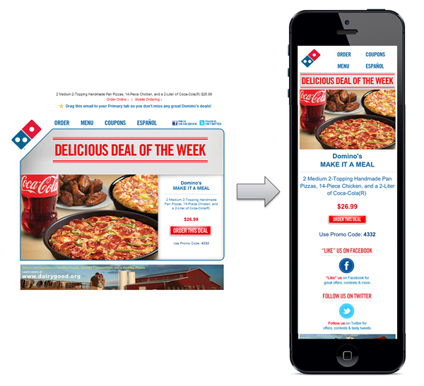
Here’s how a desktop email (left) can be reformatted to work well on mobile (right):
3. Make it easy to read.
- Don’t make your readers struggle (remember, you have three seconds before they decide whether or not to delete).
- Use 14 point for body copy (Apple will automatically resize fonts to a minimum of 13 point) and 20-22 point for headlines.
- Keep the copy short and scannable. Avoid long paragraphs, especially at the top of the email.
- Use bullets to further increase scannability
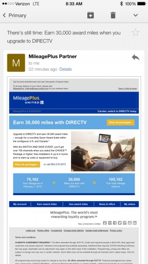
Small type and large blocks of copy make this email hard to read on a mobile device:
4. Be image-conscious.
- If readers have to wait for images to download, they won’t. Keeping a mobile email under 20kb is a good rule of thumb.
- Design your email with blocked images in mind. More than 50% of mobile phones are Android, which typically block images by default. And if an image is blocked, readers just see a big white box.
- Use HTML text in banner headlines whenever possible so the copy will show up even if the image doesn’t.
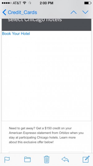
If images are blocked on your prospect’s mobile device, image-heavy emails will look like this:
71% of mobile email readers will delete an email immediately if it does not display correctly.
While you want your email to capture your brand, keep image areas small so that your key message isn’t pushed out of frame (and you avoid the white blocks caused by blocked images).
5. Keep it simple.
- In most cases, an email should have ONE primary objective with ONE destination (e-newsletters are an exception). Again, you have three seconds to make your case. If you try to say too much, nothing will be read, and you’ll lose the prospect.
- Make sure there is a prominent link/button above the scroll and another at the bottom of the email.
- If secondary destinations/links are required, place them below the second CTA button.
- Also, emails are generally personal communications, so add a personalized salutation if possible.
- Write the email in the first person and sign off with someone’s name.
- Keep the message focused on compelling reasons to click through. If the message is complicated, drive to a landing page and let it do the heavy selling.
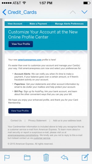
Here’s an example of a mobile email with a simple design, scannable copy and clear call-to-action:
6. Think mobile beyond the email.
You will hurt your conversion rates if users click through on their mobile devices to a landing page that is not optimized for mobile. Keep it all mobile-friendly for a seamless user experience. Or, as we like to say, “Create no reason to say no.”
Remember, if it works for mobile, it will work for desktop… but not the other way around. So think smart. Think small. Think mobile.
Sources:
- 2013 Silverpop Email Report, as cited by Internet Retailer
- Knotice Mobile Email Opens Report (2013 Overview)
- Marketing Land: “Report: 66 Percent of Email Opens On Mobile, Mostly iOS Devices” (November 2014)
- Campaign Monitor: “Reporting, Conversions and Email Campaigns”
- MarketingProfs: “Design Emails With a Mobile Mindset: Five Tips” (August 2013)
- Campaigner: “Email Habits Survey” (2014)
- Worldata (2014 research)
- bluehornet: “Consumer Views of Email Marketing” (2014)