M&T Bank Uses Website Relaunch to Teach Customers About Responsive Design
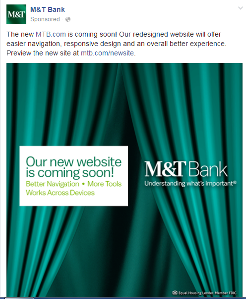
This past summer, we happened to catch a glimpse of M&T Bank’s website as it was preparing for a relaunch, and we took note of the benefits it was touting. In late July, the carousel at the top of the homepage was being used to promote the new site: “Better Navigation. More Tools. Works Across Devices.”
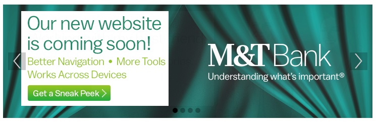
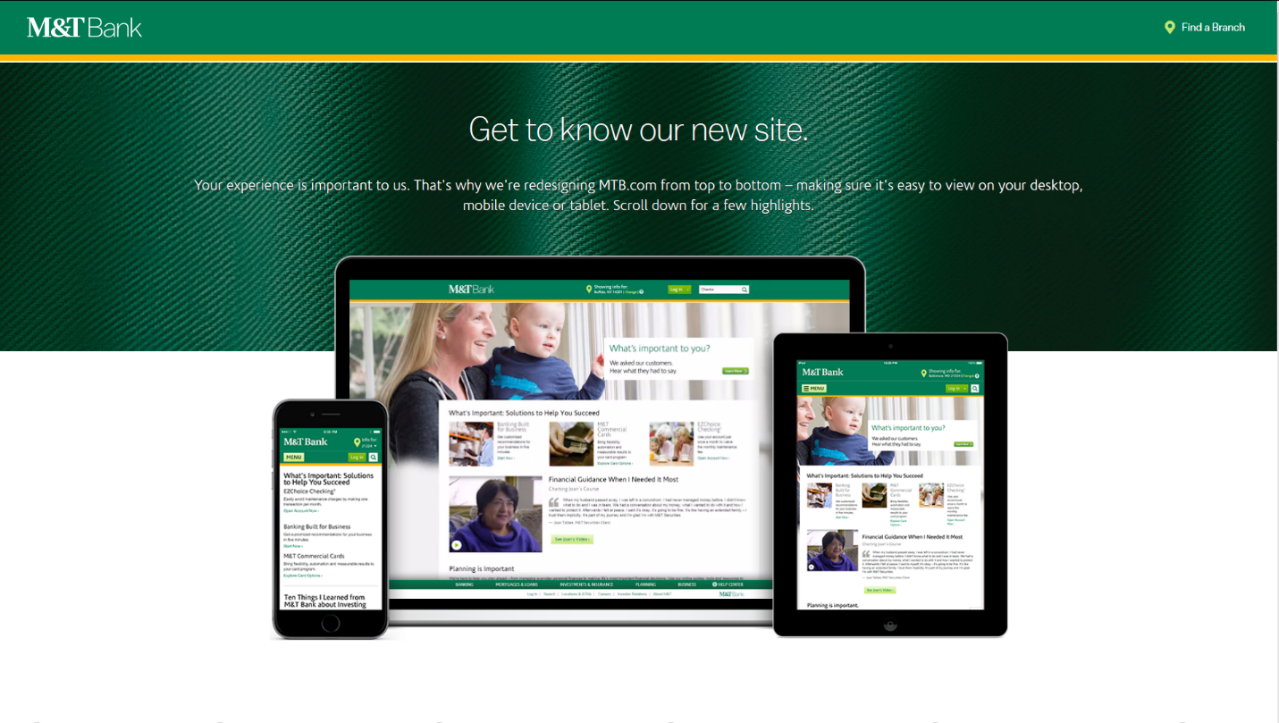
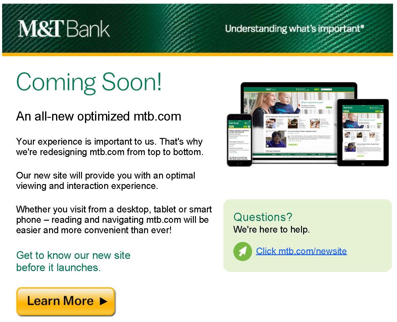
The banner in the carousel drove customers to a landing page that highlighted the new design, framing it in these terms: “Your experience is important to us. That’s why we’re redesigning MTB.com from top to bottom – making sure it’s easy to view on your desktop, mobile device or tablet.”
Right off the bat, we liked how M&T was approaching this update. In the home page promotion and the landing page, they were being up front about the fact that a new design was coming and using it as an opportunity to show customers what would be changing.
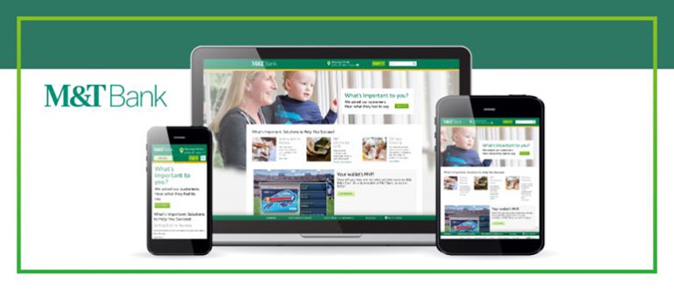
A key communications strategy for the bank was stressing that the site would be responsive. In the marketing “biz,” we’re very familiar with responsive designs which allow the same website to work across multiple devices. Given that the “old” site was not responsive, this was a key benefit for customers. (Many bank websites still have no mobile option – or limited mobile functionality – and many rely on an “app-only” approach for smartphone users.) By stressing the cross-device functionality, and supporting it with screen shots, M&T was literally showing users how the same content would be presented on different screens after the relaunch.
Promotion of this key benefit extended to other M&T marketing efforts leading up to the launch. We captured a Facebook post and an email stressing the responsive design. The email included this pitch: “Our new site will provide you with an optimal viewing and interaction experience.”
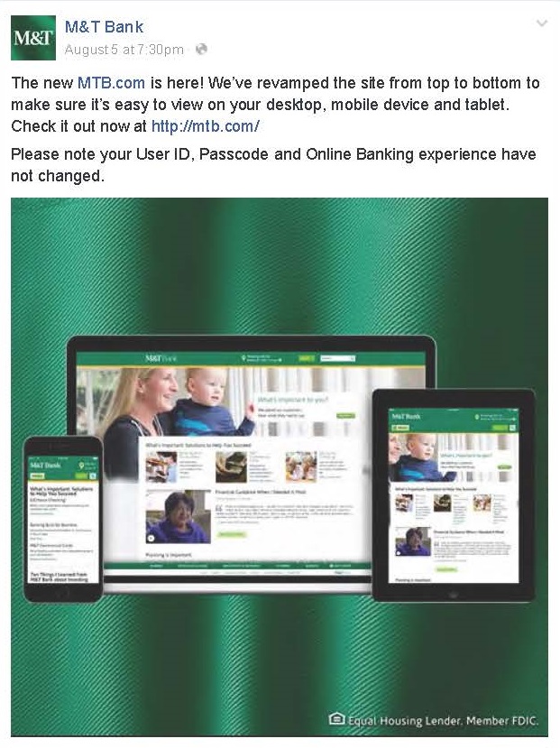
A post-launch Facebook announcement emphasized it, as well.
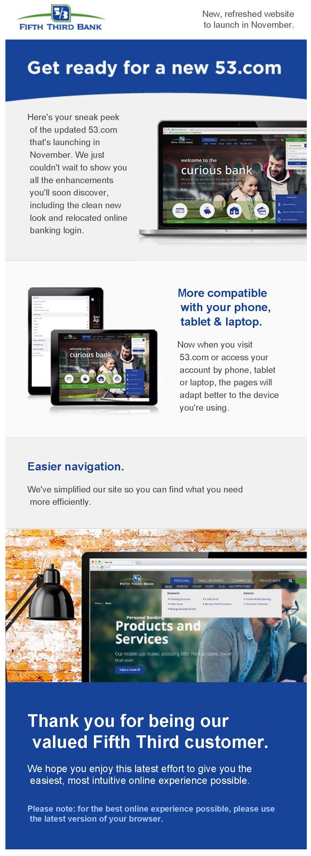
We looked around to see if other banks had also focused on responsive design as part of a website relaunch, and we found examples from Fifth Third Bank, Huntington and CreditOne.
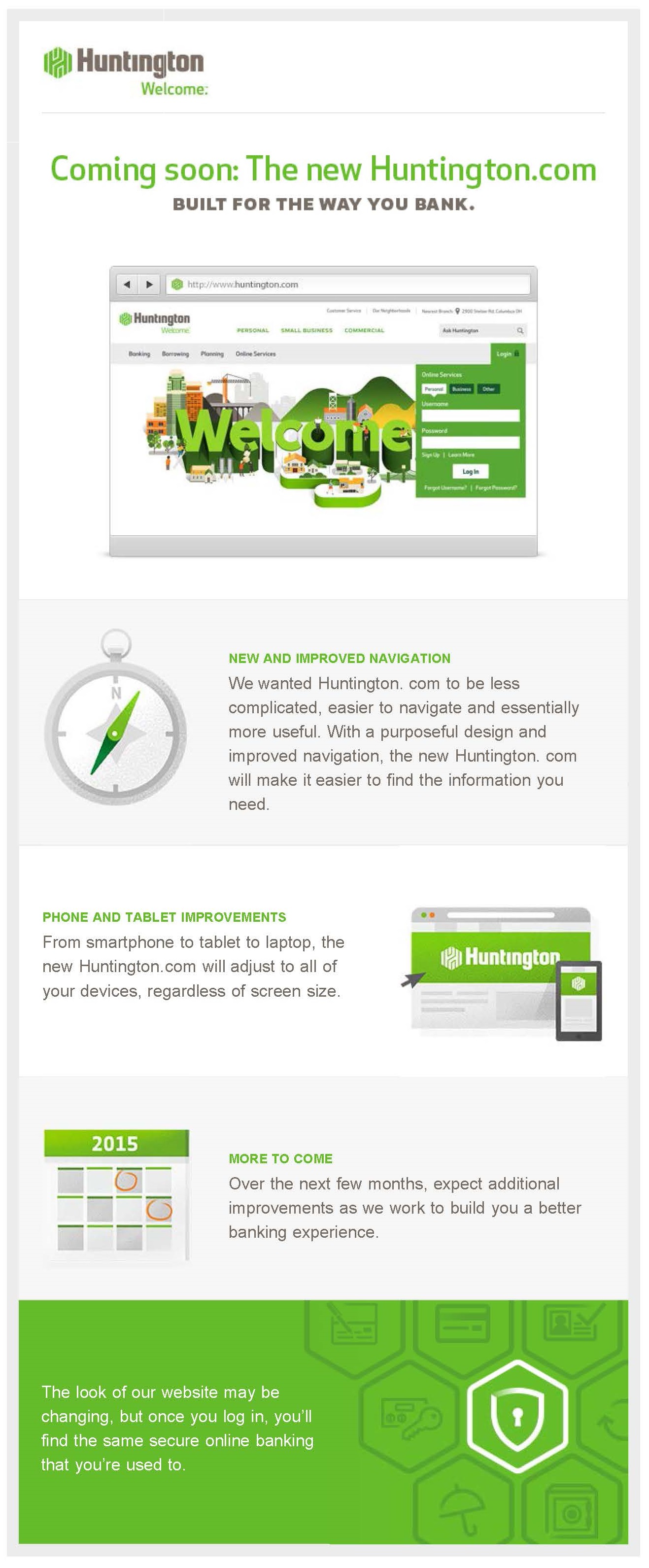
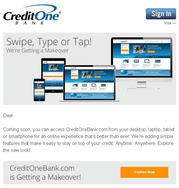
Why the focus on responsive? As more web traffic shifts to smartphones and tablets, financial institutions need to keep up. This is especially important for regional banks who need to show customers that they can compete with the top banks. These FIs are staying current with the shift in web design trends. They’re using the marketing of these relaunches as opportunities to stress customer benefits and also – with invitations like M&T’s “Get to know our new site before it launches” – taking time to “train” them.