Facebook Page Design Changes for Financial Services Marketers
Facebook recently updated its page design, and while the enhancements haven’t had marketers scrambling to fix anything broken, they have presented new opportunities that shouldn’t be overlooked by financial services marketers.
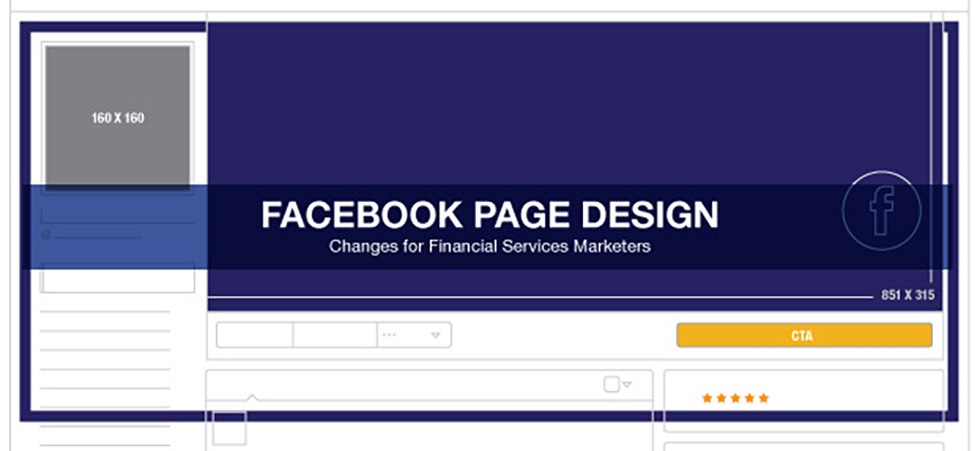
Described as less cluttered and more spacious, the new design has a number of notable key features:
- more prominent cover photo,
- resized and repositioned profile photo,
- larger and more prominent call-to-action button,
- more visible tabs and
- (for admins) easy access to the week’s insights and the ads manager.
What are the opportunities for bank and credit union marketers? Let’s take a look.
Cover photos
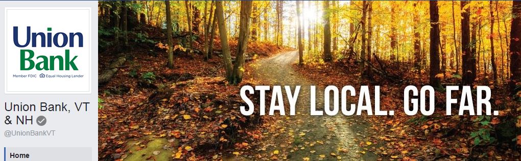
Before the design change, the cover photo was cluttered with the profile photo, page name and lots of buttons, including the Like, Message and Call-to-Action buttons. The design of the cover photo had to be built around these important page features. You now have the room to make the cover photo more visually interesting and drive home key messaging. Considering its prominence on the page, it’s a good idea to make it work for you by highlighting brand messaging, current marketing campaigns or activities that are important to your community and audience.
For example, Union Bank (a community bank in Vermont and New Hampshire) and Suncoast Credit Union (located in Tampa) use cover photos with on-brand, simple messages that resonate with their audiences, while Silicon Valley Bank (a regional bank in Santa Clara, California) uses compelling photography to capture the brand personality.


Remember, the cover photo should be optimized to be viewed on both mobile and desktop. As of 2016, the cover photo dimensions are 851 pixels wide by 315 pixels tall for desktop and 640 pixels wide by 360 pixels tall for mobile.
Profile photos and verification
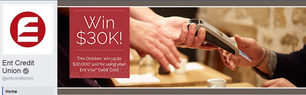
Your profile photo and username also get better visibility in the new page layout. Make sure your profile photo is sized correctly – 160×160 pixels on desktop computers and 128×128 on mobile devices – and that your page is verified, as seen on the page for Ent Credit Union (Colorado Springs). With the blue or gray “verified” check mark appearing next to your brand name, visitors can confirm that the page is authentic and that it’s the official company page.
Calls-to-action
Perhaps the most important part of the redesign is the improved prominence and positioning of the call-to-action button. Positioned in a bright blue bar right below the cover photo, the new button is hard to miss. Choose whichever CTA works best for your page: Contact Us, Send Message, Watch Video or one of nine other options. Just be sure you have one. Otherwise, your page will have a blank space in the center of the page, not to mention a missed opportunity.
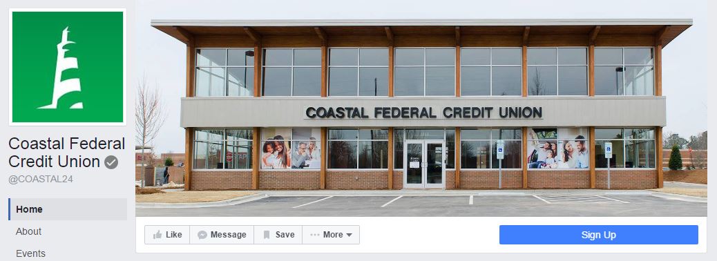
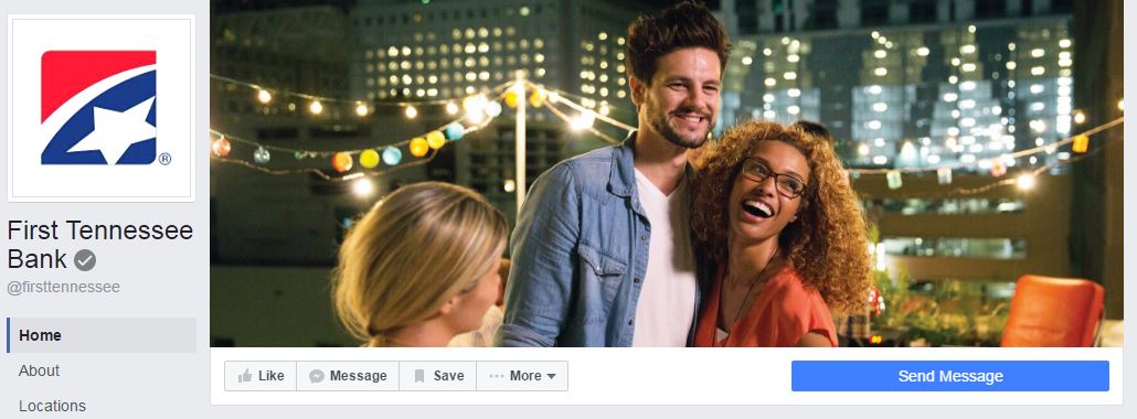
The CTA button should deliver on what it promises, as is done on the pages of Coast Federal Credit Union (Raleigh, NC) and First Tennessee Bank (a regional bank in Memphis). Coastal Federal uses the “Sign Up” button and links directly to its web page about joining. First Tennessee uses the “Send Message” button, which opens a window to contact the bank via Facebook Messenger. Don’t forget: you have the option to make two different CTA buttons – one for mobile and one for desktop.
Tabs
Facebook provides a default set of tabs that gives Pages a way to share more information. Until the redesign, tabs were tucked under the cover photo in a group, and whichever tabs didn’t fit underneath the cover photo got rolled up under the “More” dropdown menu. There wasn’t a lot of exposure for the information unless a visitor did a little digging. Now, the tabs are highly visible in a static vertical list to the left of the status updates.
Given their new visibility, it’s time to make sure the content on your tabs is updated, fresh and doing all that it can for your brand. It’s also a great place to feature community guidelines for your Facebook page. Pay close attention to the tabs for photos and videos. With the new redesign you now have the opportunity to feature a key video asset.
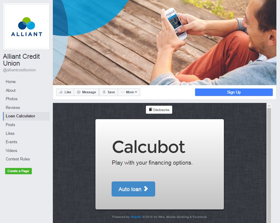
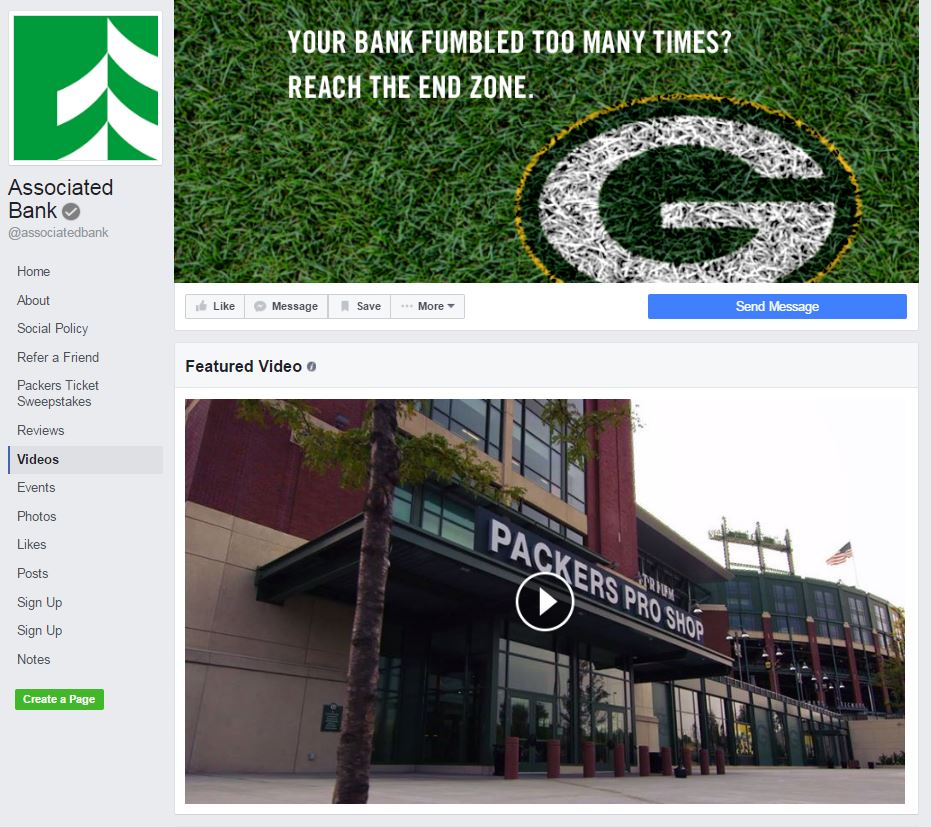
Whatever you choose, make sure it syncs with your current marketing efforts. And remember, you can manage tabs, including changing the order of tabs, removing those without content and even creating custom tabs. Alliant Credit Union (Chicago) dedicates a tab to its loan calculator, and Associated Bank (a regional bank in Green Bay, WI) uses its video tab to feature its checking account as a resource for “true Packers fans” to prep for game-day. Associated Bank’s other tabs highlight its social media policy, referral bonus and current sweepstakes.
Insights
If you’re an admin of a page, you can’t miss the prominent placement of the latest weekly analytics and post promotion tool right above posts. Perhaps this will serve as a friendly reminder of the importance of including paid promotion in your social marketing?
Even as it has been rolling out, Facebook has introduced some changes to the new layout, and it’s likely there may be more. It’s always good to step back and “View Page as Visitor” so that you are optimizing the experience from the perspective of the audience. These new Facebook updates provide an opportunity to drive home your brand’s key messaging, share more information with your audience in different ways and take advantage of paid advertising.
Interested in learning more? Connect with Media Logic on Facebook and click the “Contact Us” call-to-action button!