Mobile-First Index Coming Soon to Google: What This Means for Health Insurers
It doesn’t take a marketing professional to know that mobile has taken over. According to a 2017 Pew Research Center survey, 77 percent of Americans now own a smartphone – up from just 35 percent in 2011. As the use of mobile devices grows, so, too, does the utilization of mobile search.
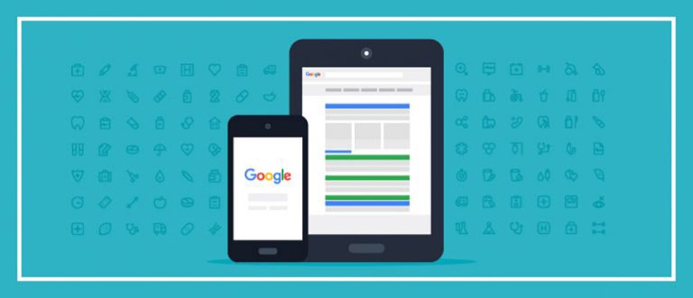
With a majority of searches performed on Google today being initiated from mobile devices, Google recently announced that it’d be migrating its search algorithm to utilize the mobile-first index for all searches. What does that mean? Currently desktop and mobile share an index, and results for both desktop and mobile are determined by this index. Content considered to be mobile-friendly may get an extra boost in mobile listings. Going forward, the index will be split into desktop and mobile, and mobile will be the primary index. This means that Google will look first at content on the mobile version of the website, rather than desktop, when deciding how to rank results.
For health insurance marketers, this recent update to the Google algorithm is positive news. Assuming the content on your website is well-crafted and optimized for mobile – including utilization of accelerated mobile pages (AMP) – this latest iteration of the Google algorithm will better serve the needs of patients, members and prospects searching for information on your site.
How does the industry prepare for the upcoming change to mobile-first indexing? For health insurers that currently have sites with responsive web design – which means the content is the same on a page-by-page basis on both desktop and mobile – Google’s new algorithm won’t require a big change. However, insurers with separate mobile sites will need to take a fresh look to make sure that the content on the mobile version is adequate, as the SERP (search engine results page) ranking will be based on this version of the website. When testing a page, always consider how each page will function from a usability perspective and how each page will render on a mobile device. To test this using Google Chrome in the developer tools panel, click on the Toggle device toolbar icon to see how a page will render on mobile.
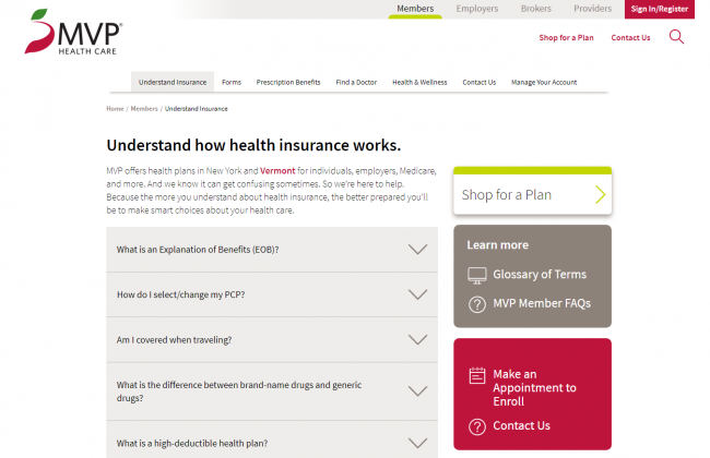
One update healthcare marketers should pay extra attention to is that tabs, accordions and expandable boxes will now have the same weight as other factors, as these tools improve the user experience on mobile. Previously, websites were penalized for having them because they were “hidden” for desktop users. Marketers may want to consider incorporating these design concepts into website design, like Media Logic client MVP Health Care has done throughout its site.
According to Google’s latest research, the time it takes to load the average mobile landing page is 22 seconds. However, research also indicates that 53 percent of people will leave a mobile page if it takes longer than 3 seconds to load. As such, page load times will become significantly more important for SERP ranking once Google prioritizes mobile search. Marketers should aim to lower page load times to 3 seconds or fewer for those pages to be beneficial from an SEO standpoint. Take advantage of tools to speed test your website, in order to avoid bounces and, as a result, poor organic search results.
While the timeline for the roll-out of Google’s new algorithm was initially expected to be in 2017, experts now believe that we won’t see the launch of Google’s mobile-first index until 2018 at earliest. However, that doesn’t mean that marketers and webmasters should be complacent. Take the steps to make sure your site is responsive, run speed tests and talk to us if you need help in getting your head wrapped around what mobile-first indexing means for your company’s website.