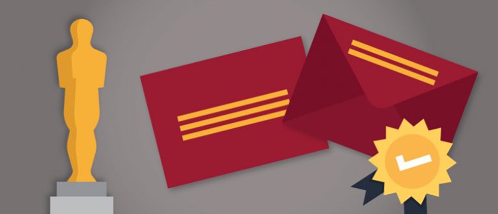
The Envelope? Please! Direct Mail Implications of the Oscars Best Picture Mess-up
As healthcare marketers, we tend to be nerds about direct mail (well, some of us anyway). After all, DM has been, and continues to be, a main stay of healthcare marketing. Many of us also love movies and the Oscars, so the Venn diagram of those who watched the Oscars on Sunday AND appreciated that the biggest mistake in its history could have implications for direct mail marketing is over-represented on our team.
For the few people who don’t know what happened late Sunday night, let’s recap:
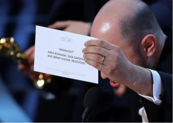
Bonnie and Clyde stars Faye Dunaway and Warren Beatty were tapped as presenters for Best Picture, the biggest award of the night. Backstage, Beatty is handed an envelope that he is told contains the name of the winning film, which we now know was Moonlight. But he is actually handed a duplicate envelope containing the name of the Best Actress Oscar winner: Emma Stone for La La Land. This inevitably leads to Dunaway reading off the wrong film, chaos ensuing on stage, dogs and cats living together, mass hysteria! (OK, it wasn’t that bad.) And, ultimately, the Oscar was correctly given to Moonlight.
Was this mistake inevitable, or was it the result of design flaws, like that viral Steve Harvey moment at the Miss Universe Pageant? And could DM 101 have saved the day? As direct mail nerds, we take a closer look.
In DM design, we often talk about the “addressing” side of an envelope (what you might think of as the front). That’s where you see your name and address and often a teaser message. On the back, or “flap” side, where you generally open the package, there may also be a teaser message. Some DM packages flip this approach on its head with what’s sometimes called a “reverse envelope.” With this approach, the address is on the “flap” side leaving what is normally the “addressing” side available for a large, uninterrupted image or message.
What does this have to do with the Oscars? We’re getting there.
You see, the Oscar envelope was similar to this “reverse” design. When Beatty comes out on stage, he’s holding the envelope with the front side down. It clearly says the incorrect award category (Best Actress in a Leading Role). But Beatty, thinking that he’s holding the Best Picture envelope, does not bother to look at that side. Why? The important side is the flap side, the place he needs to open it. That’s where the business end of this transaction takes place. The card is even nested so that it’s face up to the flap.
So Beatty opens it, looks at the card, knows it’s wrong, looks for another card in the envelope and then gets stuck. But does he flip it over to the billboard side? No. And here’s why: there’s no business there, nothing to interact with. Instead he says, “And the Oscar goes to… ,” freezes, looks at Dunaway and hands her the envelope. She doesn’t look at the front side either, sees the words La La Land on the card and reads that out. The team from that film takes the stage, and a few minutes later, chaos ensues.
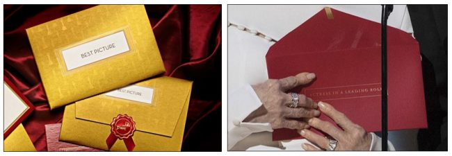
But wait! There’s more. This year, the Academy used a new design for the envelope. For several years, the coveted envelopes were gold with a knock-out white box where the category name was printed in large black type. Importantly, the category name was printed on BOTH sides of the envelope. The new design was a deep red envelope, and the category name was listed in gold type. From the photos that we have seen, it looks like the category was only printed on one side.
Let’s break down the direct mail implications of this new envelope design:
- The “reverse envelope” is not always the best choice. The appeal of the reverse envelope is that it gives marketers large open space to use for messaging. But like Beatty, what if no one flips it over? Your mail comes stacked with the address up. For a reverse OE, that’s the flap side, and there is little reason to turn it over to see the marketing message. It can easily get lost. Beatty knew his job was to open the flap and pull out the card. There was no reason to turn the envelope over (where he would have seen the wrong category name).
- Repetition, repetition, repetition. The “old” Oscar envelope design listed the category on both sides. Marketers might look at this as overkill. Why give an offer twice when you have covered it already? But making sure that you get the attention of consumers as they look at your OE is critical. For a regular envelope, recipients will look at the address and see a message next to it. But if you opt for a “reverse” OE, make sure you repeat the essential message on both sides, because while you want them to flip it over, they really have little reason to do so.
- Bolder might be better. If you really look at the new design of the Oscar envelope, you can practically hear the pitch meeting. “The red color evokes the Oscars red carpet tradition, and the gold lettering ties back to the iconic statue. Combining both with a light typeface creates an elegant feel, worthy of a premier global award show.” Except for this: if you can’t read that elegant typeface in the dark backstage when you hand it to Warren Beatty… yeah, you got problems. The “old” design used a bold, large font in black on a white background. It may not have been elegant, but it got the job done.
- Don’t forget the insert. There is one other factor that contributed to the Oscar flub – the card itself. While the winners’ names are clearly listed, the category name is at the bottom in tiny gold type. In the DM world, this is a reminder to keep the essential information prominent. While it never should have gone even that far, having the category name a little larger might have clarified the error before the wrong film was announced.
Let’s face it, ultimately the world did not end because the wrong winner was announced on Sunday, and direct mail packages are not Oscar envelopes. But it is a reminder that design and messaging matter. The envelope is the first thing consumers interact with, and – like the Oscars – you only have a few seconds to convey the right message. That starts with making sure people will (and can) read it.